AUSTRALIANS like to think of themselves as egalitarian, and for much of our history we believed our income and wealth was spread around relatively evenly. For many years the world shared that view: as early as the 1880s, visitors remarked on our relatively equal distribution of wealth, the lack of visible poverty, our generally comfortable incomes, and our relatively few millionaires. As late as 1967, prime minister Harold Holt could say that he knew of no other free country where “what is produced by the community is more fairly and evenly distributed among the community” than it was in Australia. From the 1980s onwards, however, this view of Australia came under scrutiny. As the historian John Hirst wrote: “‘Egalitarianism – see under myths’: so runs the index entry in a standard sociological text on Australian society...”
Working out what has happened to inequality in Australia over the long-term is complex. Studies by Peter Saunders, David Ingles, Ian McLean and Sue Richardson, and Andrew Leigh provide invaluable evidence about trends in income inequality since the early twentieth century; while there is some disagreement about overall trends, there does appear to have been a substantial long-term decline in inequality between the 1940s and the 1970s. But the datasets are limited – and where they exist they are based either on wage trends or income-tax data, which means that any findings will apply to individuals rather than households.
Better data since the 1980s
Since the Australian Bureau of Statistics, or ABS, starting its income surveys in the late 1960s, the availability and quality of household income statistics has improved dramatically. But it was not until 1981–82 that the surveys became regular – first, every five years or so, and more recently every second year. The most recent survey, which covers the 2009–10 year, was released by the ABS at the end of August. With the release of high-quality data has come a dramatic increase in studies of income distribution trends, fuelled by the establishment of research centres such as NATSEM (the National Centre for Social and Economic Modelling) at the University of Canberra and the work of researchers like NATSEM’s Ann Harding.
Over the years the ABS has gone to a lot of trouble to improve the data collected in income surveys, but an unavoidable by-product of better data is that it is not always comparable with earlier findings. Chart 1 provides a broad picture of overall trends by putting together estimates based on different measures of income. Between the 1980s and the middle of the 1990s these are based on annual income, but since the middle of the 1990s the ABS has published figures using weekly income. The “revised” figures from 2003–04 onwards show a higher level of inequality than earlier estimates because they include a broader range of income sources (for example, non-cash benefits provided to employees, termination payments, irregular overtime and all bonuses).
The trends in Chart 1 are mapped using the Gini coefficient, one of the most commonly used measures of income inequality. The Gini coefficient varies between zero and one: if everyone had exactly the same income then it would be zero (perfect equality), and if one household had all the income then it would be one (complete inequality). The chart shows that the Gini coefficient was around 0.27 in 1981–82 and 0.328 in 2009–10, which means that income inequality has risen over that period.
Chart 1: Trends in income inequality (Gini coefficient) in Australia, 1981–82 to 2009–10
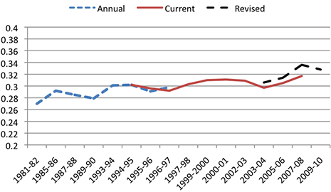
Source: Estimated from ABS income surveys, various years.
The ABS stresses that changes from year to year are not large enough to be statistically significant. Yet the cumulative picture is of an upward trend, punctuated with periods in which inequality has fallen: in the second half of the 1980s, again in the second half of the 1990s, in the early 2000s, and finally in the most recent two years (although the ABS cautions that this should also not be considered as a significant change). These figures show that the common view of the past thirty years – that “the rich have been getting richer and the poor poorer” – is not an entirely accurate description of what has happened in Australia. They are also a useful reminder that the factors producing higher or lower inequality can change in not entirely predictable ways.
We can also look at inequality within different types of households – age pensioners and the retired, for example, or couples with children, lone parent families or single people. Income inequality among lone parent families (Gini coefficient of 0.262) is lower than among couples with children (0.312), or couples without children (0.357), and inequality is highest among single-person households (Gini coefficient of 0.387).
Or we can focus on geography. Over the past half-decade, income inequality has increased most significantly in Western Australia. Indeed – as Chart 2 shows – if that state were a country it would be about as unequal as Portugal, and only a little less unequal than the United States. If the Australian Capital Territory or Tasmania were countries, on the other hand, they would be about as unequal as Norway. Inequality has risen fastest in Western Australia but so have average incomes – 76 per cent in real terms since the mid 1990s compared to the Australian average of 57 per cent. But the average income of the richest 20 per cent of West Australians has more than doubled, and this group received more than half of all the income growth that the state’s households enjoyed over the fifteen-year period.
Chart 2: Level of income inequality (Gini coefficient) among OECD countries (2005–08) and Australian states (2009–10)
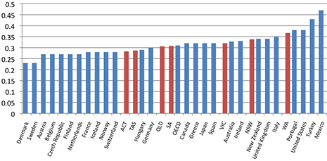
Source: OECD and ABS.
Turning back to Australia as a whole, it is certainly true that the rich have become richer. The best-off 20 per cent of households now enjoy real incomes 67 per cent higher than comparable groups in the mid 1990s, and they receive just over 40 per cent of total household income, compared to 38 per cent in the mid 1990s. But while the overall income share of the rest of the population has fallen, real disposable incomes have risen – by between 46 per cent for the poorest 20 per cent of households and nearly 50 per cent for the median household. So the rich have become richer – but so has everyone else.
It’s worth remembering that this is a picture of what has happened to groups of people. Plenty of individuals and families are worse off now than they were in the past, because they have retired, become unemployed, divorced or separated, or become sick or disabled. Other individuals have become better-off as they have moved into work, been promoted in their jobs or have developed businesses. All that the figures tell us is that even if individuals have experienced these risks or these benefits, groups of individuals are financially better-off than comparable groups in the past.
Rising inequality appears to have had different causes in different periods. Overall, wages are the most important single source of income for households; wage inequality among both men and women has increased, although wage inequality between men and women fell in some periods. Research by David Johnson and Roger Wilkins suggests that the recessions of the early 1980s and early 1990s resulted in higher earnings inequality, mainly because of a significant increase in the proportion of households that had no earnings and were receiving government benefits, mirrored by an increase in the number of two-earner families at the richer end of the income distribution.
The recovery from the mid 1990s, which continued until the global financial crisis in 2008, was also accompanied by rising inequality, most rapidly after 2003. Inequality in wage rates continued to increase, but this was offset by increasing employment; as a result, earnings inequality fell among people of working age, mainly because lower-income groups benefited from higher employment rates. In particular, research by Siobhan Austen and Gerry Redmond found that changes in women’s earnings, and partnered women’s earnings, were associated with downward pressure on family income inequality between 1995–96 and 2007–08. In the 1980s and early 1990s, the growth in women’s employment and earnings was greatest in households with relatively high male earnings. From the mid 1990s, the growth in women’s employment was concentrated in households with the lowest male earnings, and this helped to stabilise family income inequality.
Since the GFC
Chart 1 suggests that there was a slight decline in inequality (although, as the ABS points out, this is likely to represent no real change) since the global financial crisis set in. This contrasts with earlier recessions in the 1980s and 1990s, when inequality rose. Of course, Australia technically escaped recession – although unemployment did increase from around 4 per cent to 6 per cent, before coming down to around 5 per cent now.
On the face of it, Australia’s recent experience does seem similar to that of countries that suffered much more from the GFC – or the Great Recession, as it is more commonly known in Europe and the United States. A new study, The Great Recession and the Distribution of Household Income, produced by an international research team led by Stephen Jenkins of the London School of Economics, looked at what has happened between 2007 and 2009 in twenty-one countries including Australia – although not in great detail in Australia’s case. It found that in the two years following the crash of 2007, household income distributions hardly changed, even where national GDP fell sharply. Over this period, and for most countries studied, average disposable household income levels generally fell slightly, and poverty rates and income inequality changed little.
Countries appear to have cushioned households from the immediate effects of the Great Recession by means of benefits and other social safety nets. With governments cutting public spending and raising taxes to confront structural deficits, however, the study predicts that household incomes will be hit for five or ten years – or even longer, depending on when economic growth returns. Cuts to a country’s welfare system are likely to lead to greater instability in household income levels, poverty rates and income inequality. Instability is less likely in countries that already have relatively healthy fiscal balances and are not facing large tax rises or benefit cuts (Sweden and Germany, for example) compared to those, like Ireland, saddled with both problems, or Britain, which lies between the two extremes.
Because the latest ABS income survey was only published at the end of August there aren’t yet any studies that analyse in any detail what happened in Australia between 2007 and 2009 (although Peter Martin gives a useful summary of broad trends). Some fairly broad comparisons are possible, however. Both average and median household disposable income fell by about $11 a week between 2007–08 and 2009–10, for instance, the first fall in thirteen years. The average number of employed persons per household also fell, although it remains at the second-highest level recorded in these surveys. The proportion of households whose principal source of income is a government pension or benefit increased from 23.2 per cent to 25.1 per cent, although that is the second-lowest level since the mid 1990s and remains below the level in 2005–06.
But while the general picture given by the income surveys is of gradual or incremental change, this is not the case for all groups. As mentioned above, income inequality in Western Australia has continued to increase significantly. For particular groups and specific income sources, trends are also disparate. For example, Chart 3 shows trends in inequality among households with a head aged sixty-five years and over since 2000–01. In contrast with the general picture of relatively small changes, there have been very large shifts in inequality for older people. Up until 2000, income inequality among older households was much lower than among the population generally, but it then accelerated dramatically, so that by 2007–08 the Gini coefficient had risen from about two-thirds that of the population as a whole to match (and for older couples to exceed) overall income inequality.
Chart 3: Trends in income inequality (Gini coefficient) among households with a head aged sixty-five years and over, Australia, 2000–01 to 2009–10
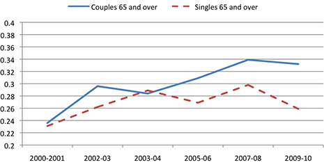
Source: Estimated from ABS income surveys, various years.
The rise in inequality among older households appears to have been driven mainly by rapidly increasing income from capital, and is likely to have been associated with the boom in the share market prior to the GFC – between 2003 and late 2007, the All Ordinaries Index rose by around 140 per cent. In a preliminary analysis of trends in the incomes of working-age families since the 1980s, Gerry Redmond and I have found that the main factor driving increasing income inequality after 2003 was rising income from increasingly unequal capital sources, which more than offset the equalising impact of employment growth.
Correspondingly, Chart 3 shows that income inequality among older households fell in the period that corresponds to the GFC, particularly for older single-person households. It can plausibly be argued that part of this decline in inequality was a consequence of the fall in the stock market – which has fallen by about 30 per cent since its peak. But another likely factor is the very large increase in the value of the single age pension in the 2009–10 federal budget, following the recommendations of the Harmer Pension Review.
Wealth – even more unequal than income?
For many years, statistics on the distribution of wealth were even sparser than comprehensive statistics on the distribution of income, although there were important early studies, including by John Piggott in 1984. The improvements in income statistics achieved by the ABS were more recently matched by the collection of information on wealth – or more precisely on “net worth” (assets minus liabilities), with the ABS collecting this information in 2003–04, 2005–06 and again in 2009–10 as part of its most recent income survey.
A recent study for the ACTU by researchers at Empirica Research, Duke University and Harvard Business School points out that the distribution of wealth in Australia is much more unequal than people think and that Australians favour a more equal wealth distribution. According to the ABS:
the wealthiest 20 per cent of households in 2009–10 accounted for 62 per cent of total household net worth, with average net worth of $2.2 million per household. The poorest 20 per cent of households accounted for 1 per cent of total household net worth and had an average net worth of $32,000 per household.
This means that the wealthiest 20 per cent of Australian households had net worth that was nearly seventy times as high as the least wealthy 20 per cent. In contrast, the 20 per cent of Australian households with the highest disposable income were about five times better-off than the poorest 20 per cent. So it seems pretty clear that wealth is much more unequally distributed than income – or is it?
The ABS survey presents two ways of looking at the distribution of wealth – first, by ranking households simply by the amount of wealth they have, and second, by ranking households’ assets by how much income they have. These two approaches yield remarkably different pictures of the distribution of wealth. This reflects the fact that people accumulate wealth over their life. Young people starting off in their first job generally don’t have much in the way of wealth, but as they grow older they will purchase homes – which has been the great wealth “equaliser” in Australia – and accumulate superannuation and other savings. As a result, older people have much higher average wealth than younger people, but older people generally have lower incomes than younger people.
When the ABS ranks households by their incomes, the 20 per cent with the lowest incomes have average net worth of around $435,000 while the 20 per cent with the highest incomes have about $1.4 million in net worth. This means that the poorest one-fifth of households, measured by income, hold 12 per cent of net wealth while the richest one-fifth hold 39 per cent, a ratio of about 1 to 3.2. This is an increase over the ratio for 2003–04, when the highest-income households had about 2.4 times the net wealth of the lowest-income group, which suggests that the equalising effect of home ownership was weaker at the end of the decade than towards the beginning.
Despite the increase in the ratio, these figures suggest that wealth is actually more equally distributed than income. This reflects not only the higher rates of owner-occupied housing among older age groups, but also the fact that a number of the households that show up as having low incomes may not in reality be as poor as they appear.
For some time, the ABS has pointed out that some households report extremely low or even negative income in the income survey – so low that they are well below the safety net of income support provided by social security pensions and allowances. Studies of income and expenditure reported in the ABS’s 1998–99 Household Expenditure Survey have shown that these households tend to have expenditure levels that are comparable to those of households with higher incomes (and slightly above the average expenditures recorded for the lowest fifth). This suggests that these households are not suffering extremely low levels of economic wellbeing, and would tend to distort any analysis of income distribution analysis that included them. (Peter Saunders and Bruce Bradbury argue, however, that the problem applies only to the lowest 3 or 4 per cent of households.) We should be careful about reaching firm conclusions about income distribution levels, and the best approach is likely to involve considering as wide a range of measures of economic wellbeing as possible.
More like the United States?
Public perceptions of trends in income inequality are often influenced by debates about developments in the United States, where there has been significant concern about growing income inequality for some time, and especially since the Great Recession. Are we following the same path? As mentioned above, the richest 20 per cent of Australians receive about 40 per cent of all household income; in the United States, the richest 10 per cent receive 49 per cent of all income – a substantially larger share of income to half the share of households.
The ABS income surveys also reveal that the richest 20 per cent of Australians gained 44 per cent of all the growth in household income from the mid 1990s to 2010, a symptom of our growing inequality. But in the United States, research by Emmanuel Saez at the University of California–Berkeley found that the richest 1 per cent of households captured 50 per cent of all the income growth between 1993 and 2007, a trend towards widening disparities that is much stronger than in Australia.
Another indicator of the difference between Australia and the United States is the difference between mean and median net worth in each country: the greater the difference between the mean and the median, the more skewed (unequal) is the distribution. In Australia, average net worth in 2005–06 was about A$563,000, or 66 per cent higher than the median net worth of around A$340,000. In the United States, by contrast, research for the Federal Reserve Board found that in 2007, average net worth was US$595,000 but median net worth was US$125,000, a difference of nearly five to one.
Where to from here?
There are legitimate disagreements about what constitutes unacceptable inequality. Some might argue that any increase in inequality should be countered by higher redistribution through more progressive taxes and more generous social spending, while others would argue that increasing inequality is part of the process of generating higher incomes for all Australians. From a narrower statistical perspective, we can be concerned about increasing inequality simply because “averages mislead”: higher average incomes do not necessarily benefit all Australians if the income gains only accrue to higher income groups. To date, this has not been the experience in Australia – the benefits of strong average income growth over the past decade have been more widely shared than in the United States.
Nevertheless, it is important to monitor trends in inequality, since without reliable statistics we would not know enough about what is happening to different groups in Australian society. In order to understand real trends we need reliable statistics, which is why we should be grateful to the Australian Bureau of Statistics for continuing to collect high-quality data on income and wealth. •